CREATE THE BEAUTY THAT MOVES THE WORLD
THE ASK
We were tasked with defining a modern, beauty tech-rooted identity for L’Oréal SAPMENA’s Big Bang Beauty Tech Innovation Program. As the region’s largest open innovation competition in the beauty sector, this program encompasses more than 40,000 startups and $20 billion in deal flow.
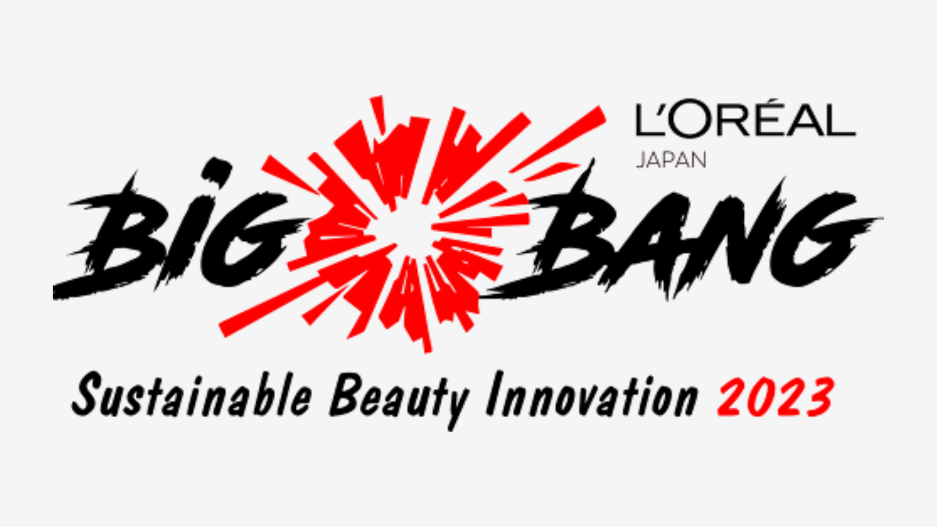
The new identity needed to signal momentum while elevating craft, credibility, and elegance on a global scale. The challenge involved replacing the 2020 pilot logo, which featured a simplistic explosion paired with marker text, with a sophisticated design that reflects L’Oréal’s modernity and ambition.
THE PROCESS
We explored widely: makeup iconography forming an explosive bloom; sparks-of-inspiration systems; and cosmic cues. After extensive ideation and refinement, we focused on a typographic direction that balances the fluidity of beauty with the precision of technology, creating harmony between craft and innovation.
Shortlisted options were evaluated for clarity even at small sizes, distinctiveness in a crowded innovation space, cultural versatility across SAPMENA, with potential for a motion language that scales from mobile to stage.
THE PROCESS
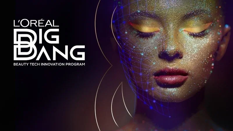
The chosen design captures the program’s essence with a refined, future-forward typemark, conveying gravitas and presence across a wide range of applications. We then engineered an elegant motion signature that embodies breakthrough—the program’s “Big Bang.” The animated logo integrates light effects, dynamic depth, and smooth easing, its modular construction ensuring scalability across openers, transitions, and loops. The result: seamless adaptation to physical, digital, and hybrid experiences.
THE LAUNCH
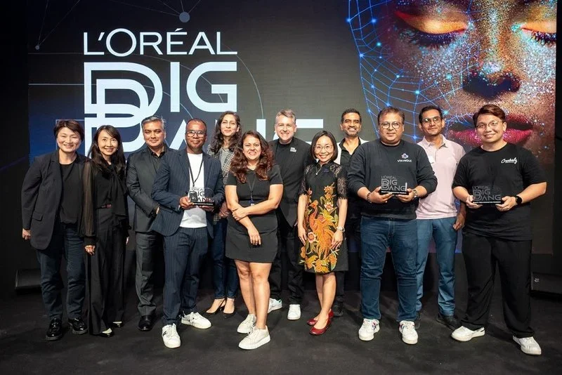
The toolkit-led rollout applied the identity across key touchpoints, including event key visuals and grand stage backdrops. This enabled consistent adoption by partners and channels across the SAPMENA region. Key deliverables included a versatile logo suite, a refined color system, and comprehensive usage guidelines.
The toolkit-led rollout applied the identity across key touchpoints, including event key visuals and grand stage backdrops. This enabled consistent adoption by partners and channels across the SAPMENA region. Key deliverables included a versatile logo suite, a refined color system, and comprehensive usage guidelines.